
BRIEF
“What goes around, has well & truly come back around.” This means the brief is about the return of past ideas, materials, or systems in a modern way.
FERRERO ROCHER
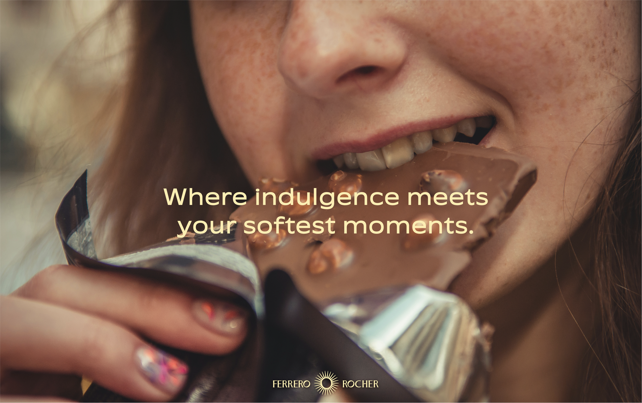
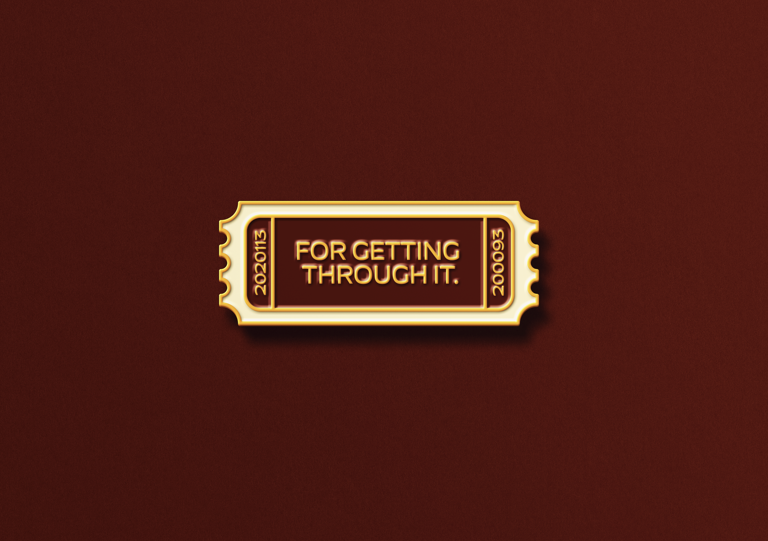
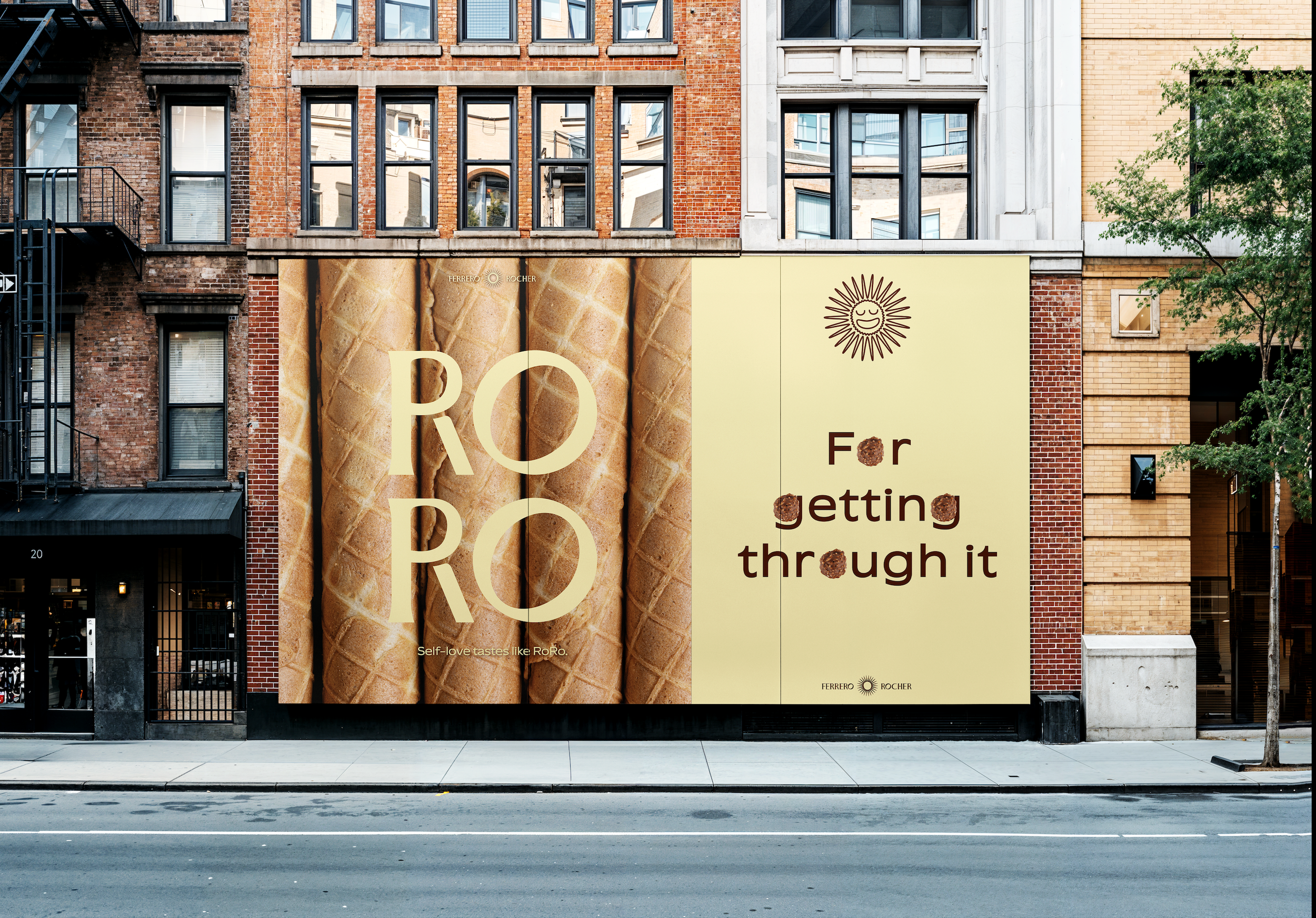
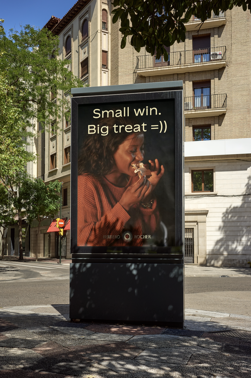
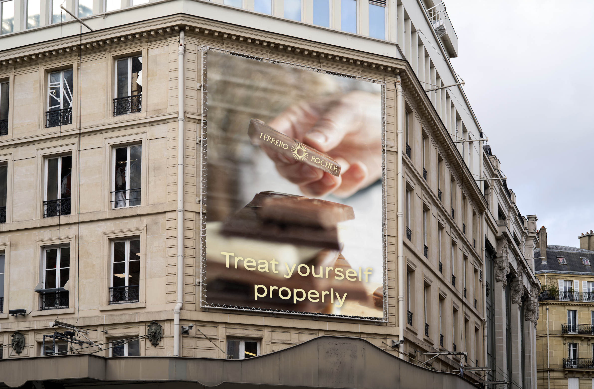
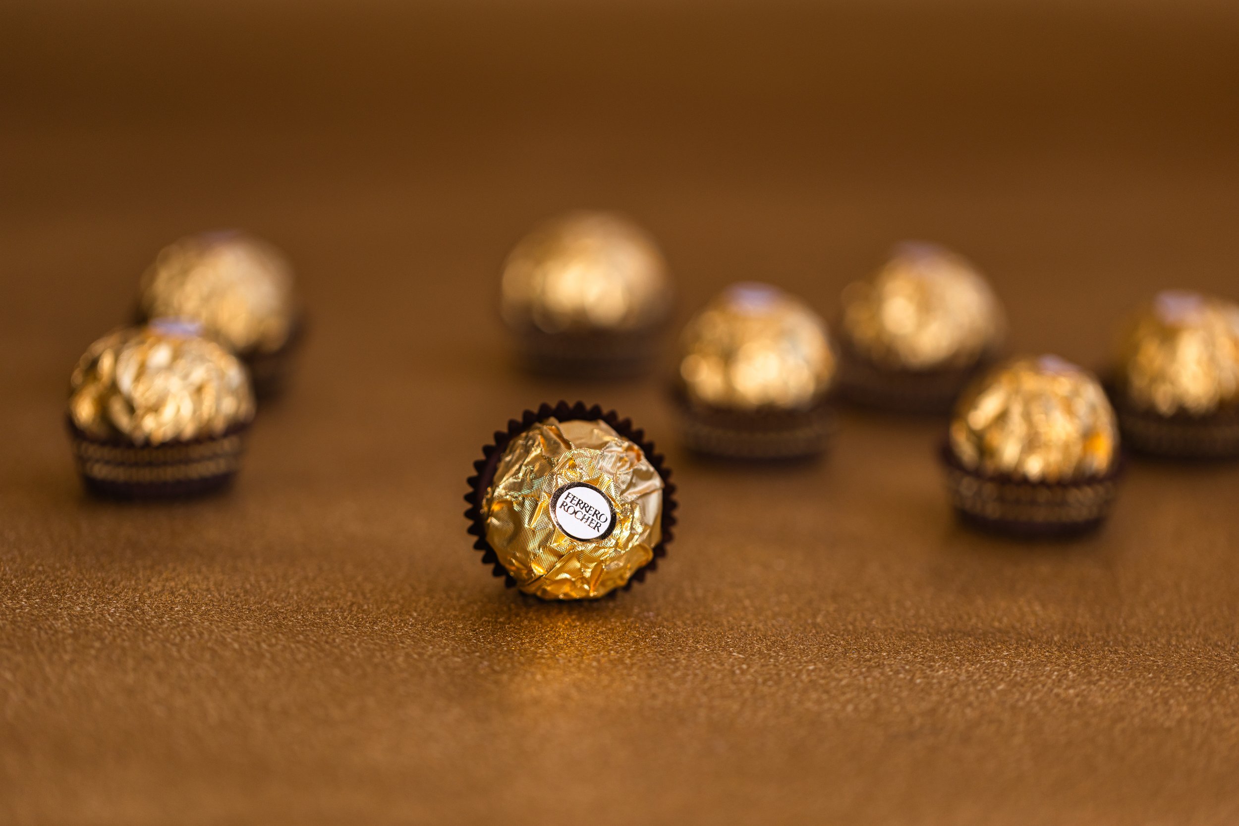
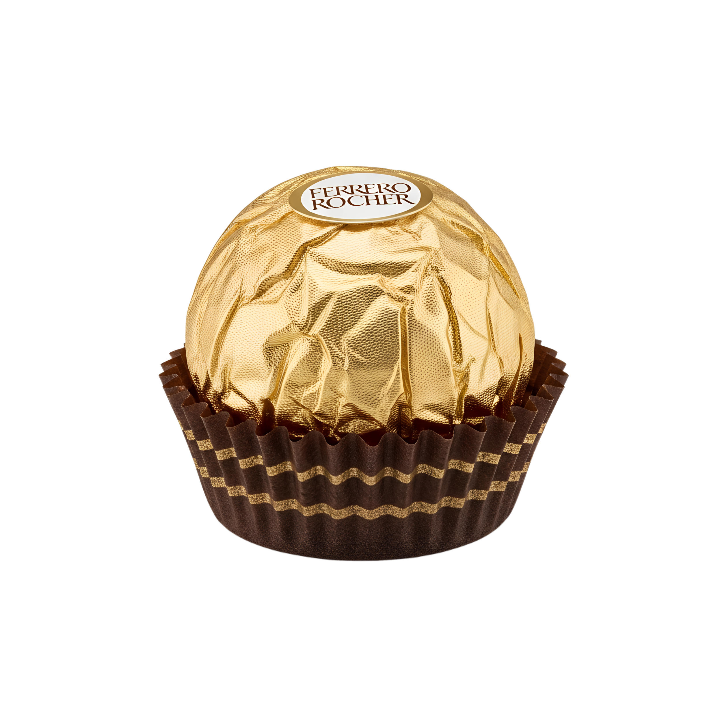
To attract younger, year-round consumers, the brand should move beyond its dated luxury tropes and embrace a modern brand refresh. Instead of making Ferrero as a brand that’s only remembered when gifting someone, it would be better if I transformed the brand into a “Ferrero Rocher from gifting to self-reward”.
LOGO IDEA
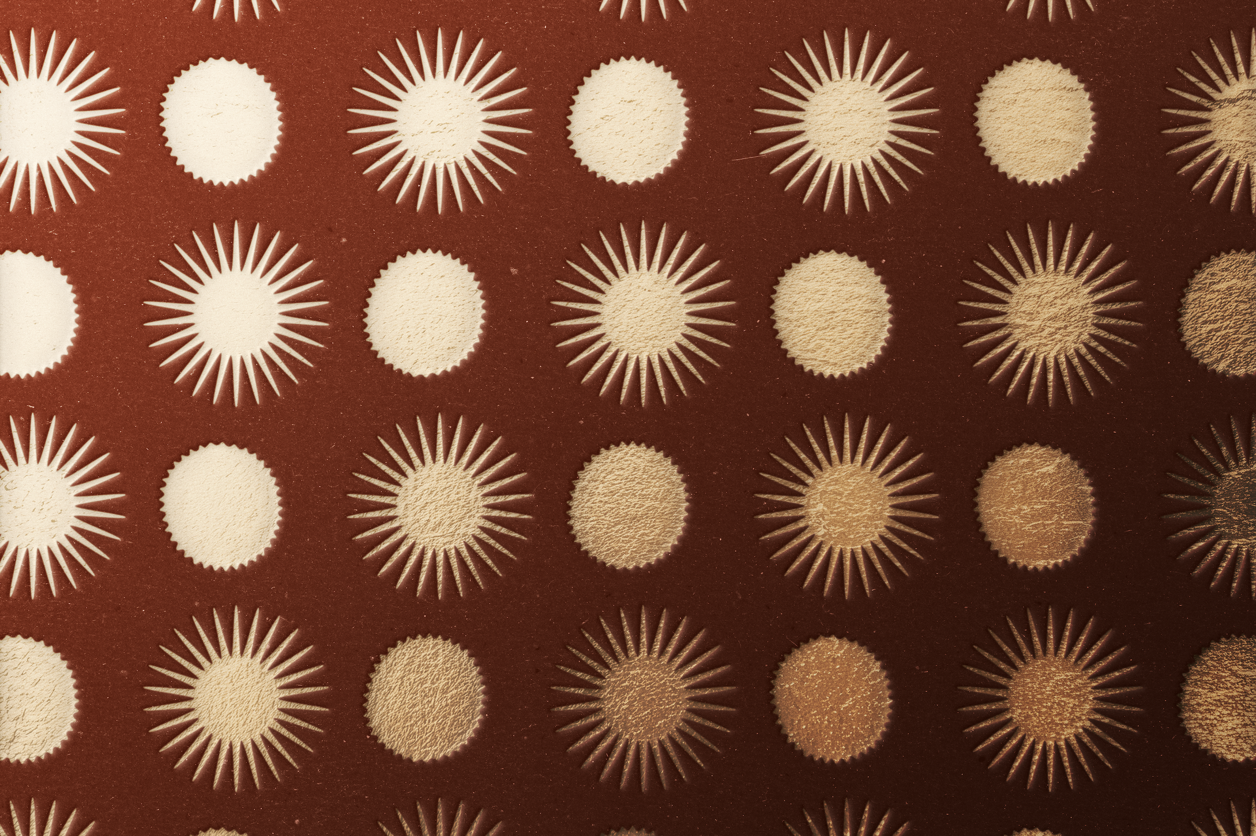
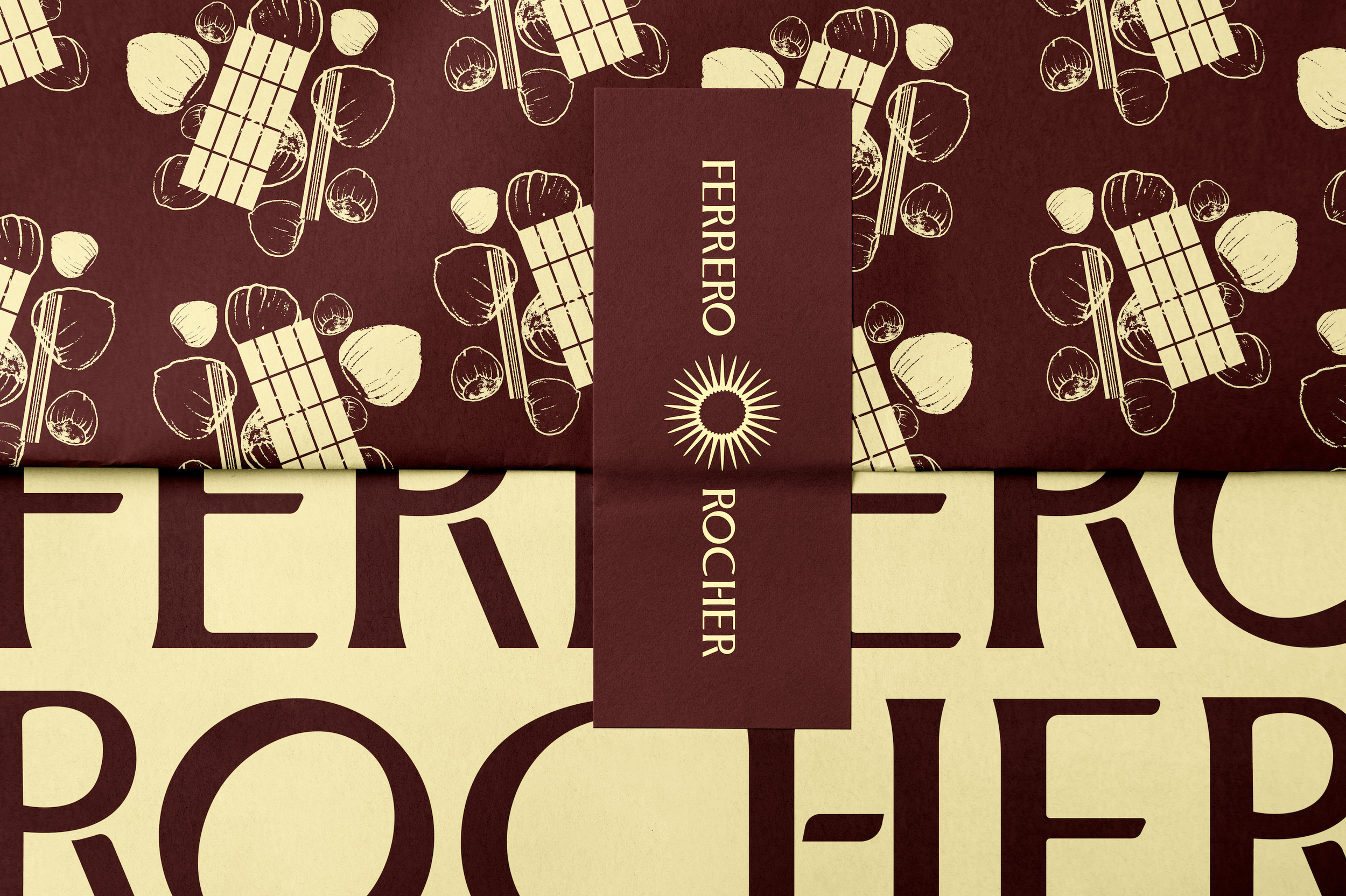
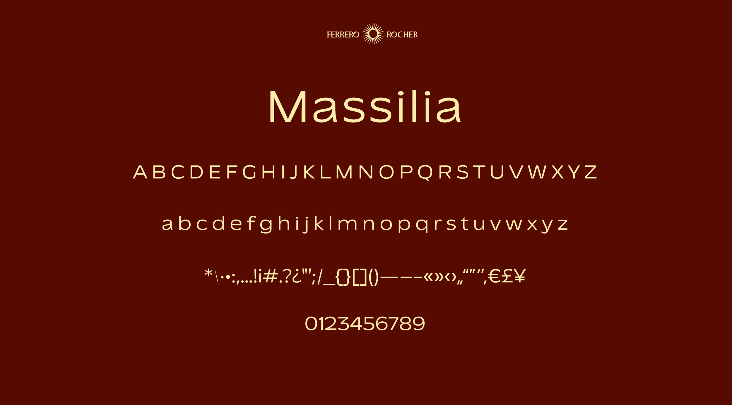
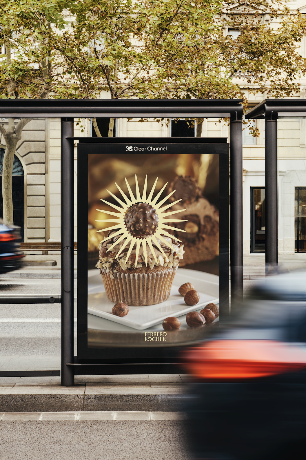
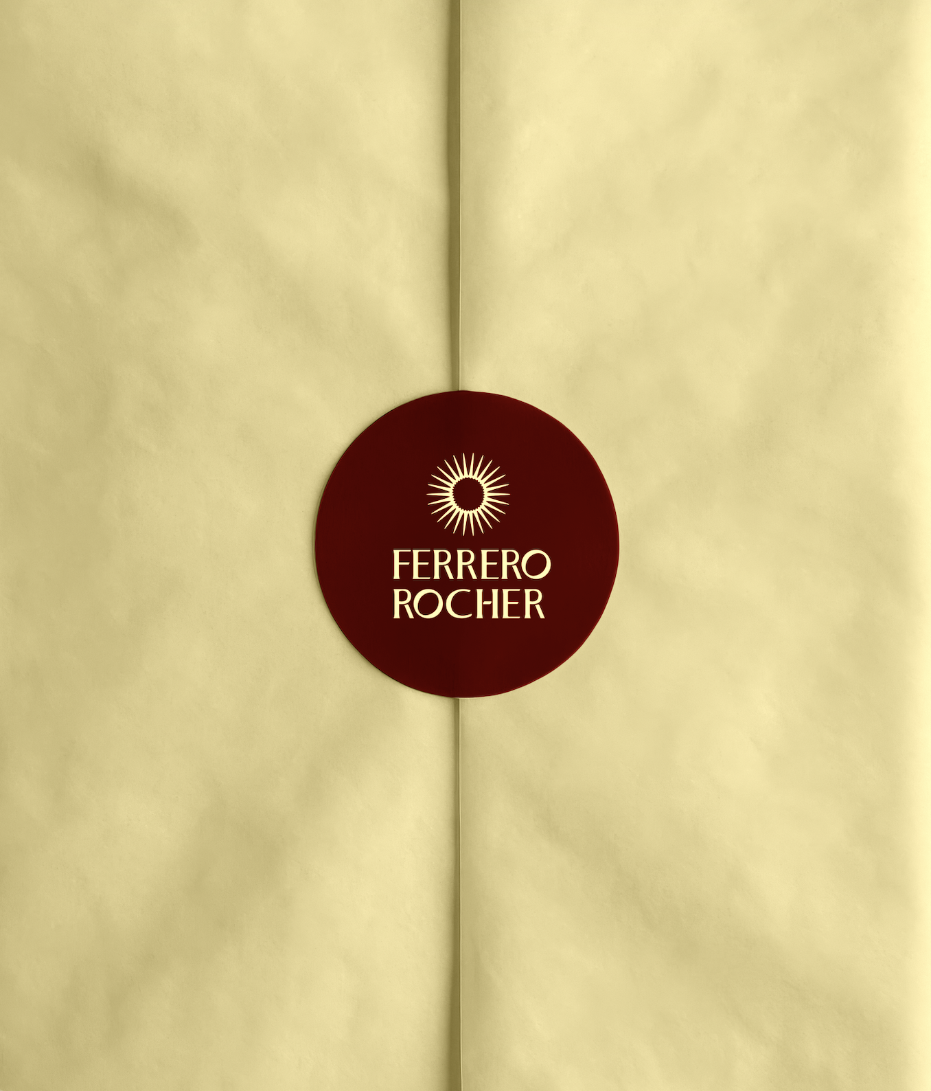
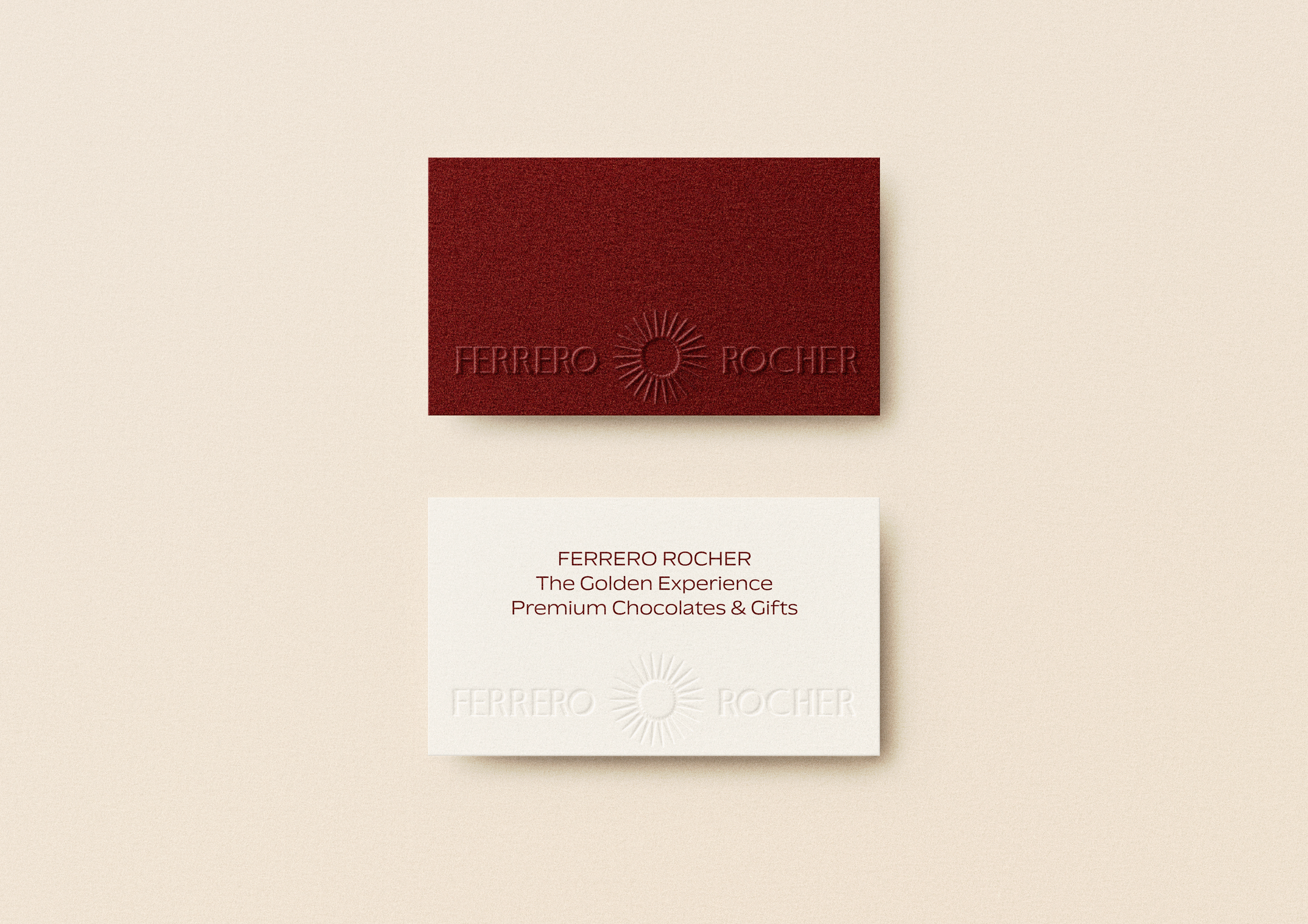
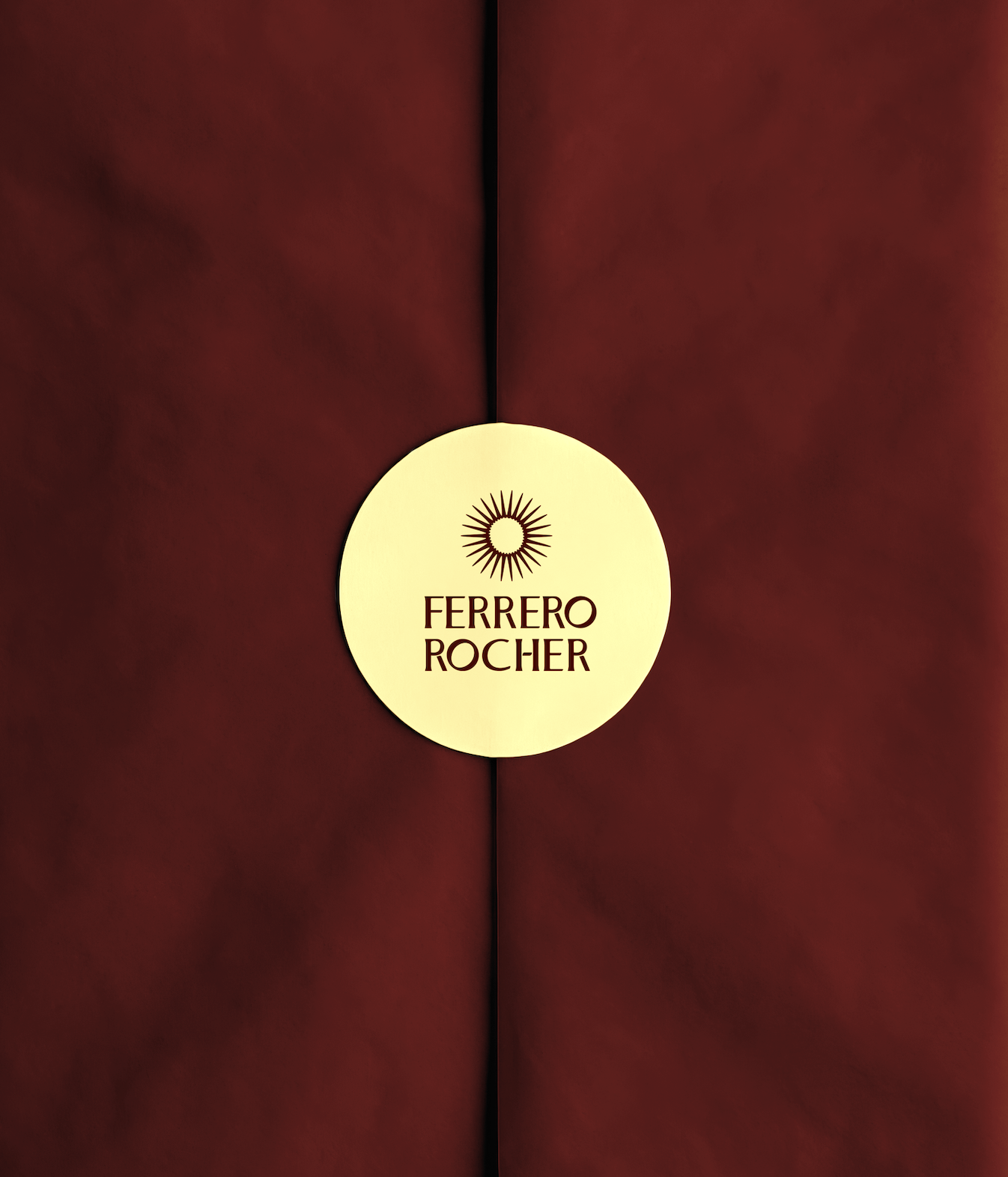
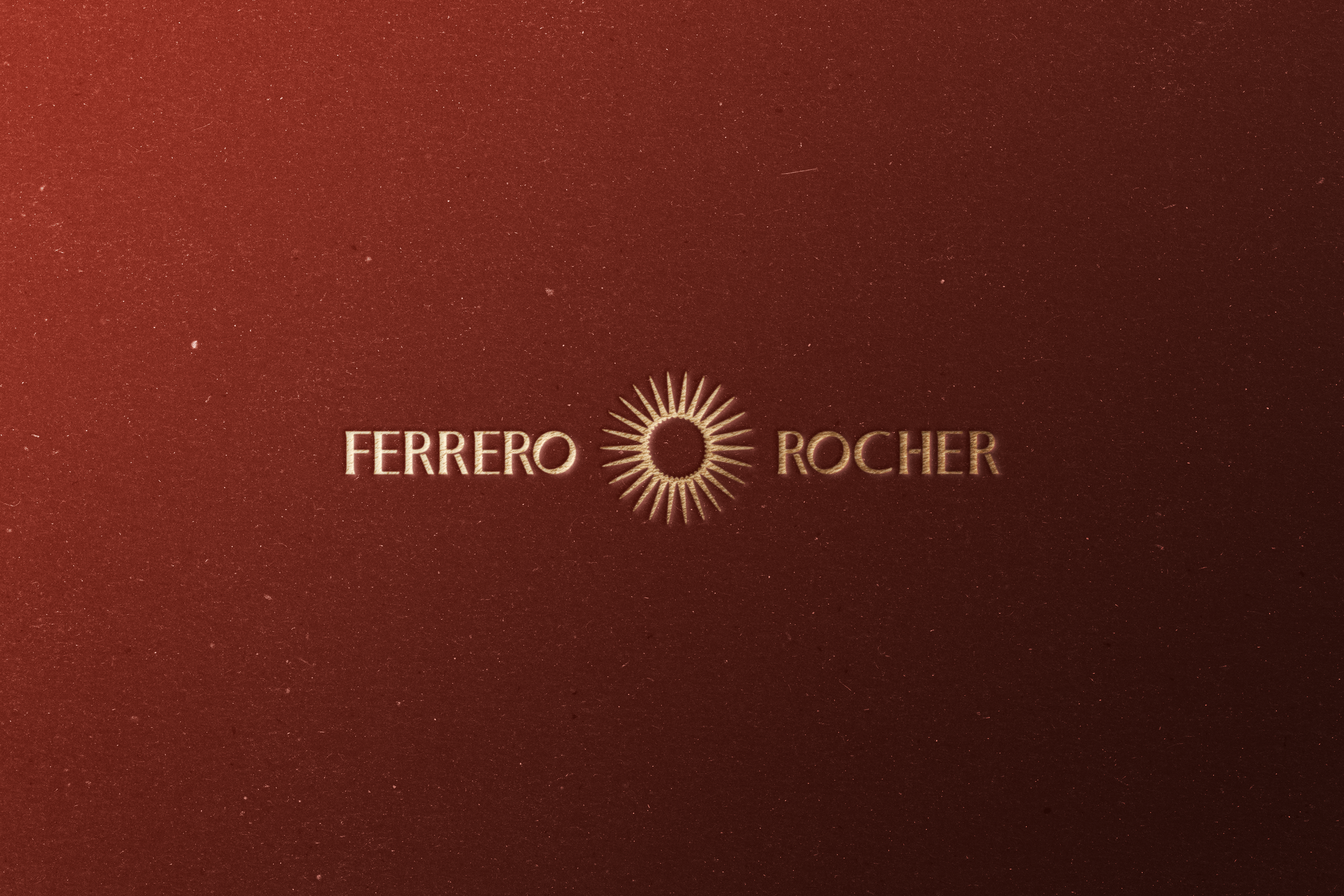
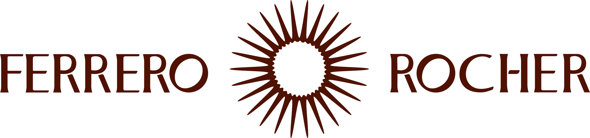
The logo draws inspiration from the Ferrero Rocher praline, with the central sun-like form echoing its round, golden core. It symbolises luxury warmth, golden indulgence, and joy, translating the product’s rich, layered experience into a radiant visual mark that reinforces celebration and self-reward.
Live Brief from JDO partnered with Pentawards
JDO x PENTAWARDS
Year
2026
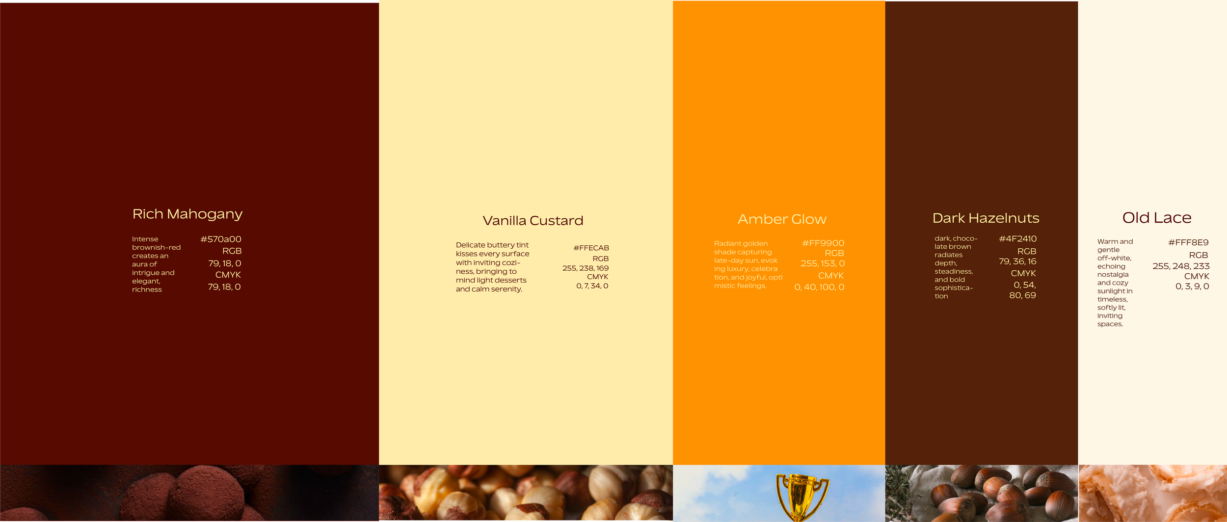
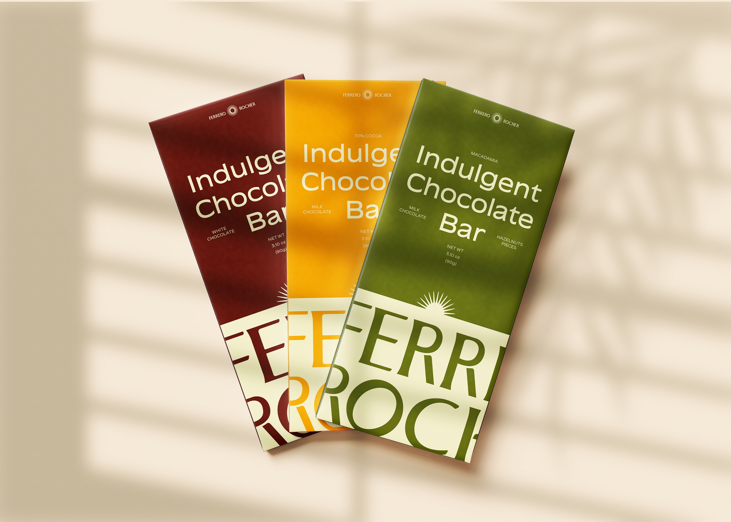
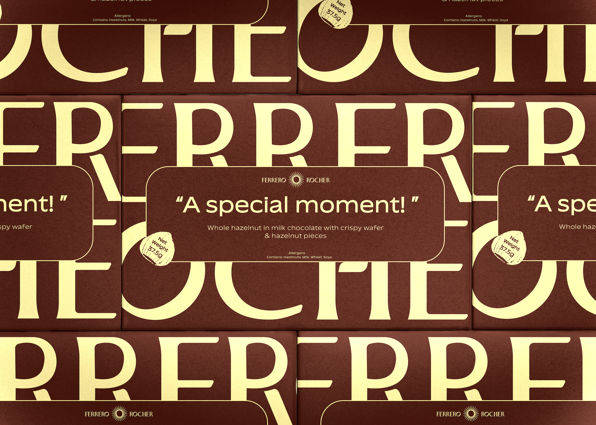
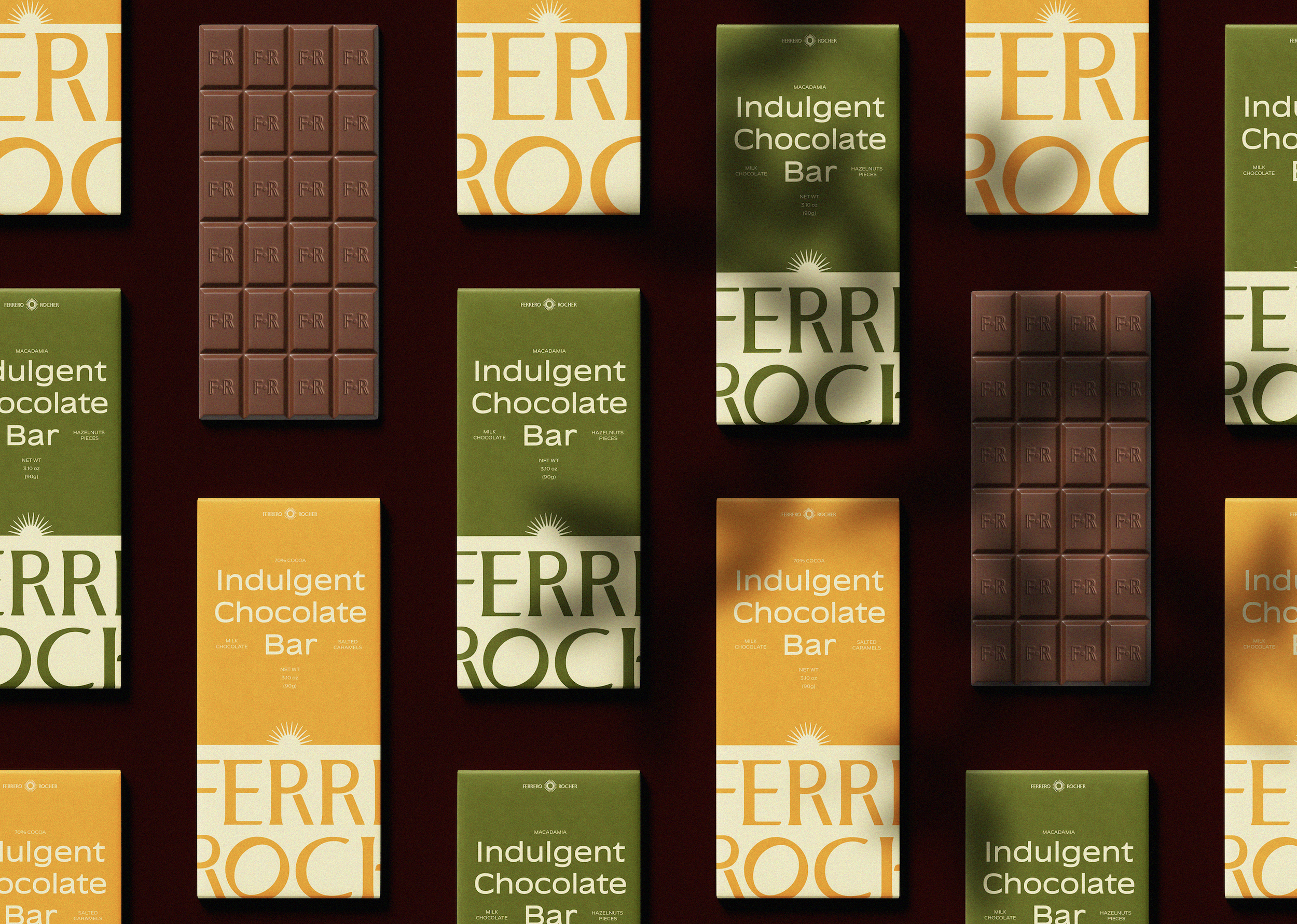
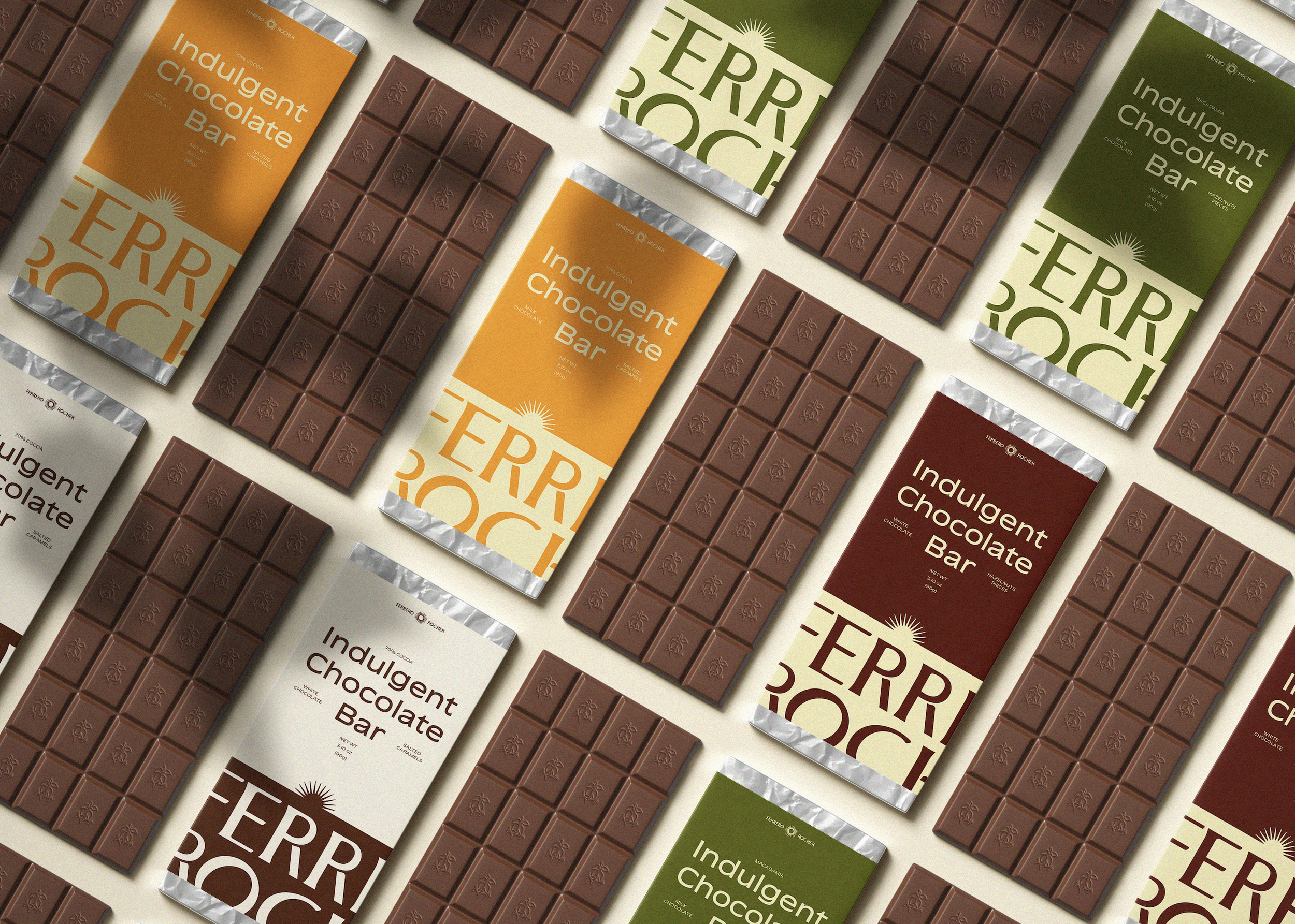
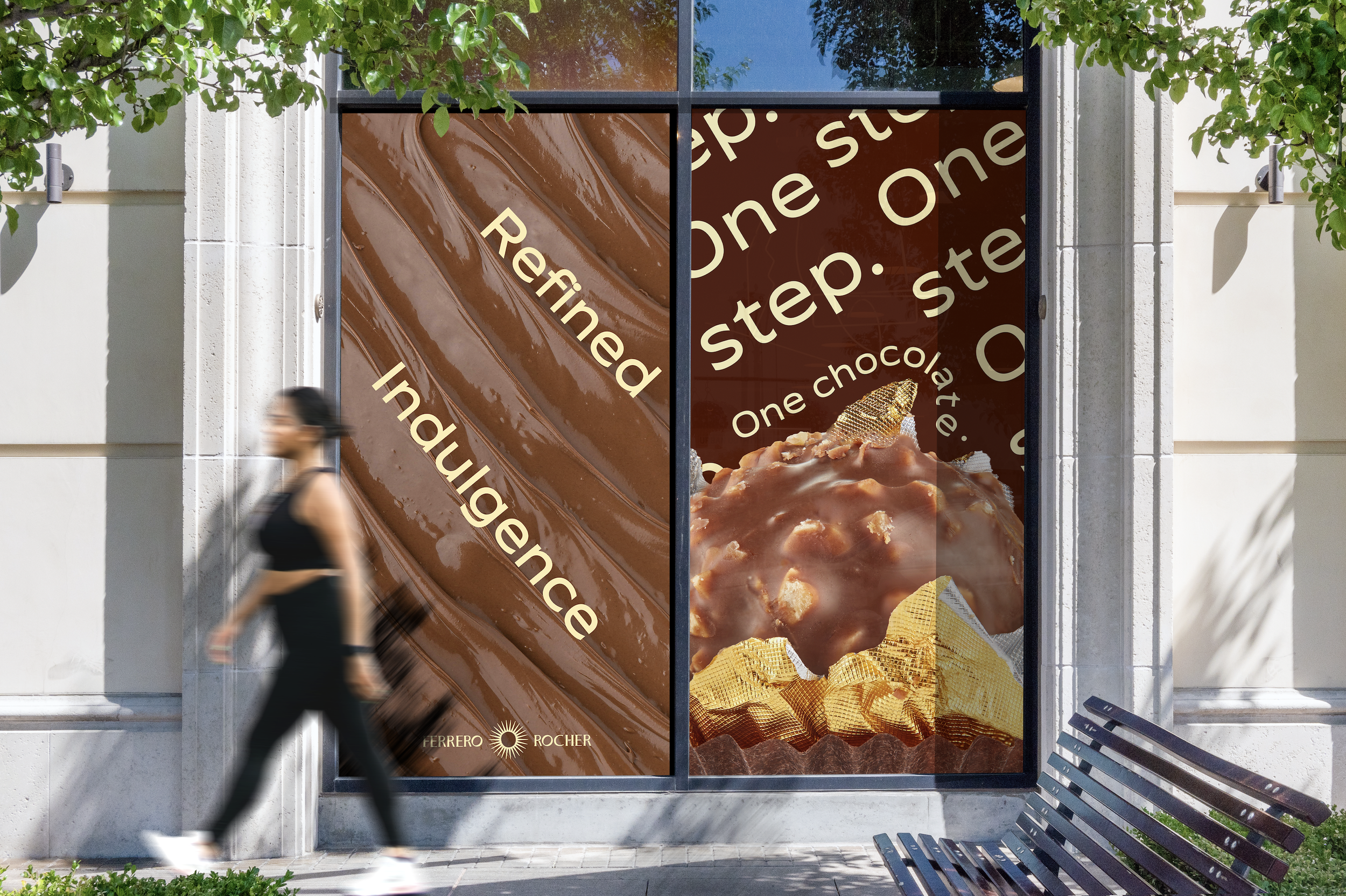
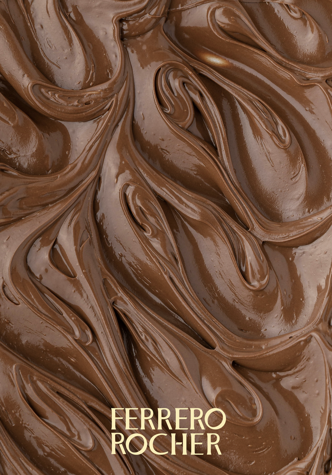
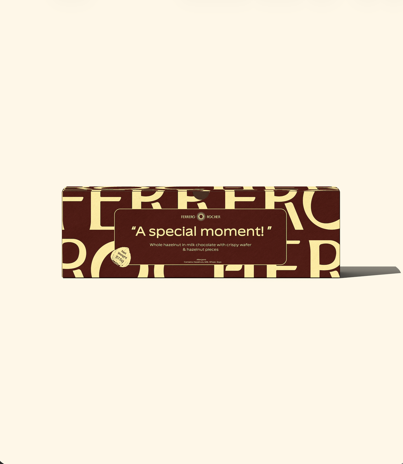
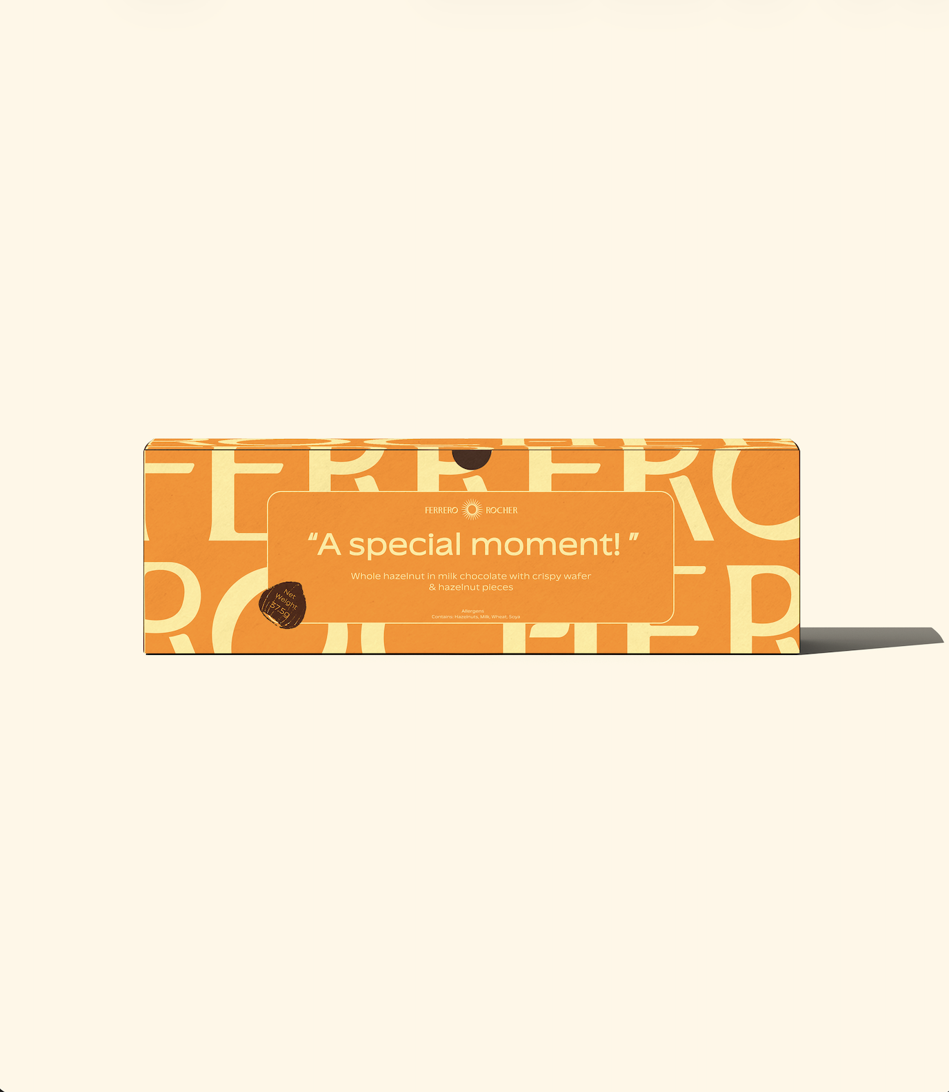
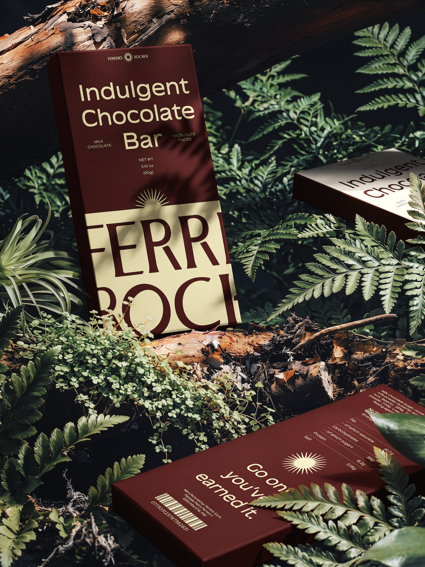
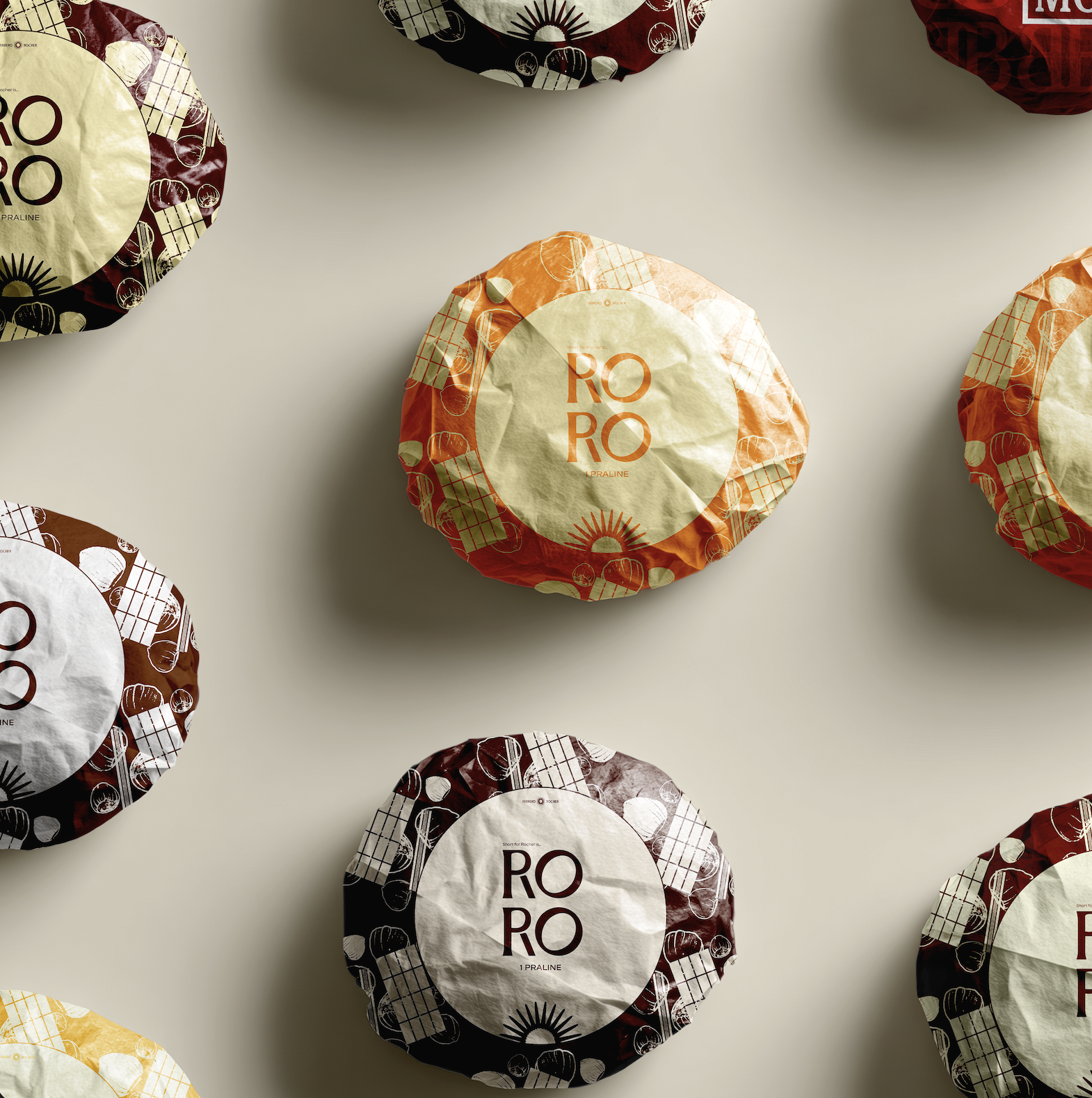
A richer, emotive palette reinforces this shift: deep mahogany and dark hazelnut add depth, amber gold signals signature luxury, while soft vanilla and warm off-white introduce warmth.
PACKAGING
*
PACKAGING *
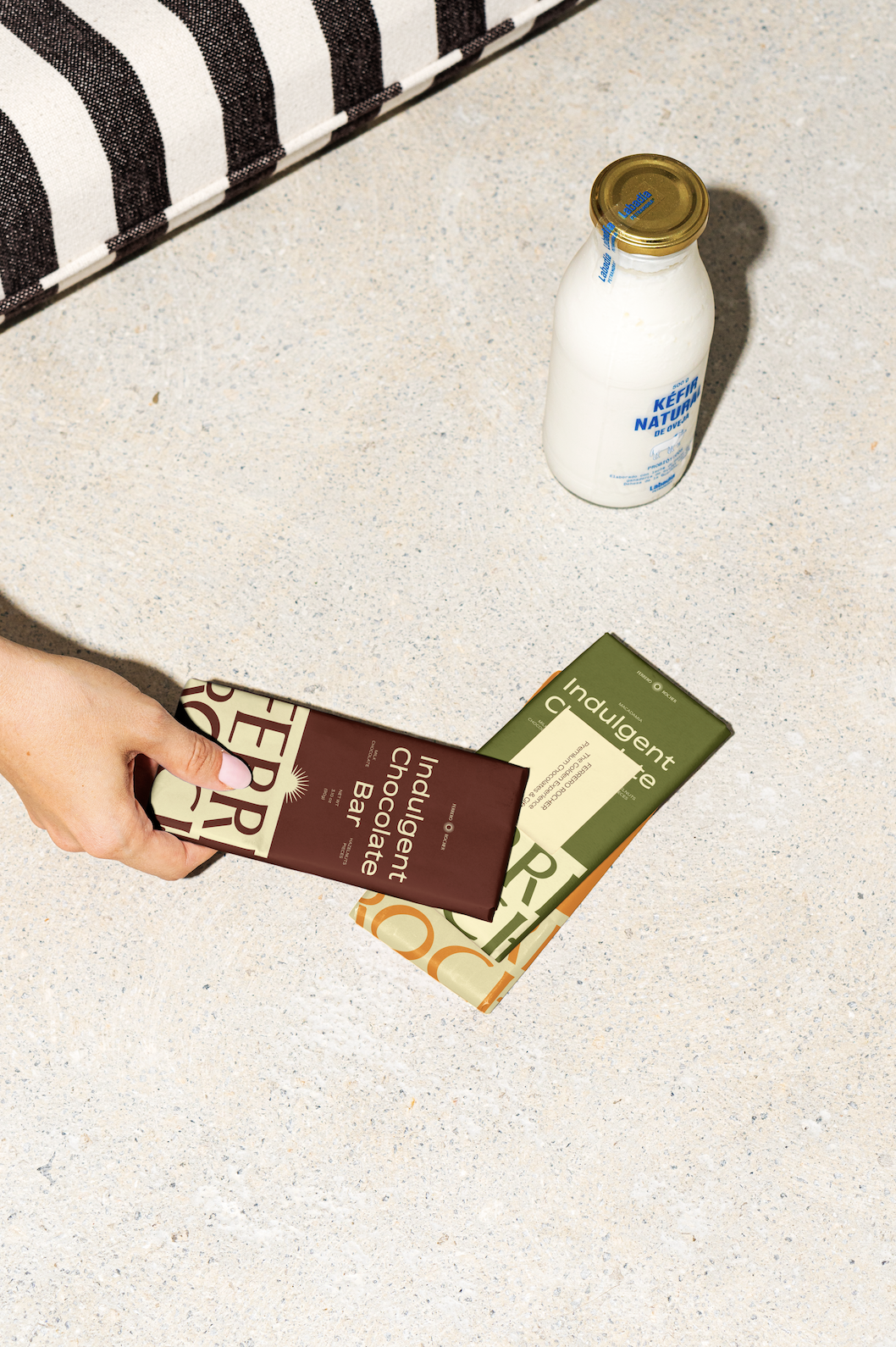
This initiative repositions Ferrero Rocher from a formal gift to a year-round self-reward for younger audiences. By blending premium cues with subtle, self-aware humour, it feels more contemporary and accessible, transforming it into an everyday indulgence for both small and meaningful wins.